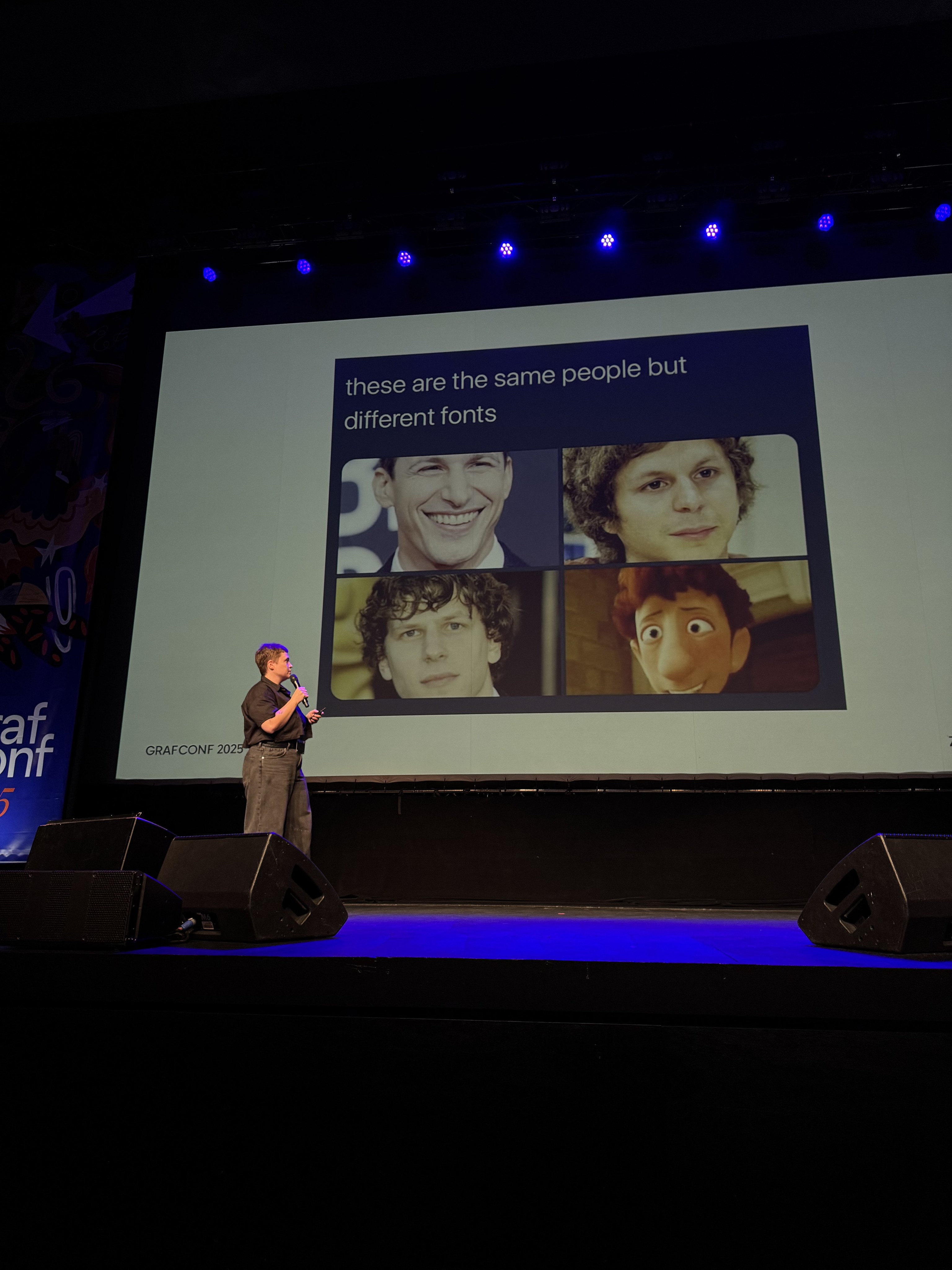
Can something as abstract as letters, have anything to do with gender? A quick Google search for “masculine font” or “feminine font” brings back clear results.
But does it have to be this way? What makes us read gender into letters in the first place? Are there visual qualities that make some typefaces feel “masculine” or “feminine”? And if so — where do those associations come from, and are they truly universal?
Let’s look for a moment where these patterns can be questioned. Is it possible to design letterforms beyond gendered divides — not to reproduce cultural clichés, but to create new spaces for expression and identity?
view full project at
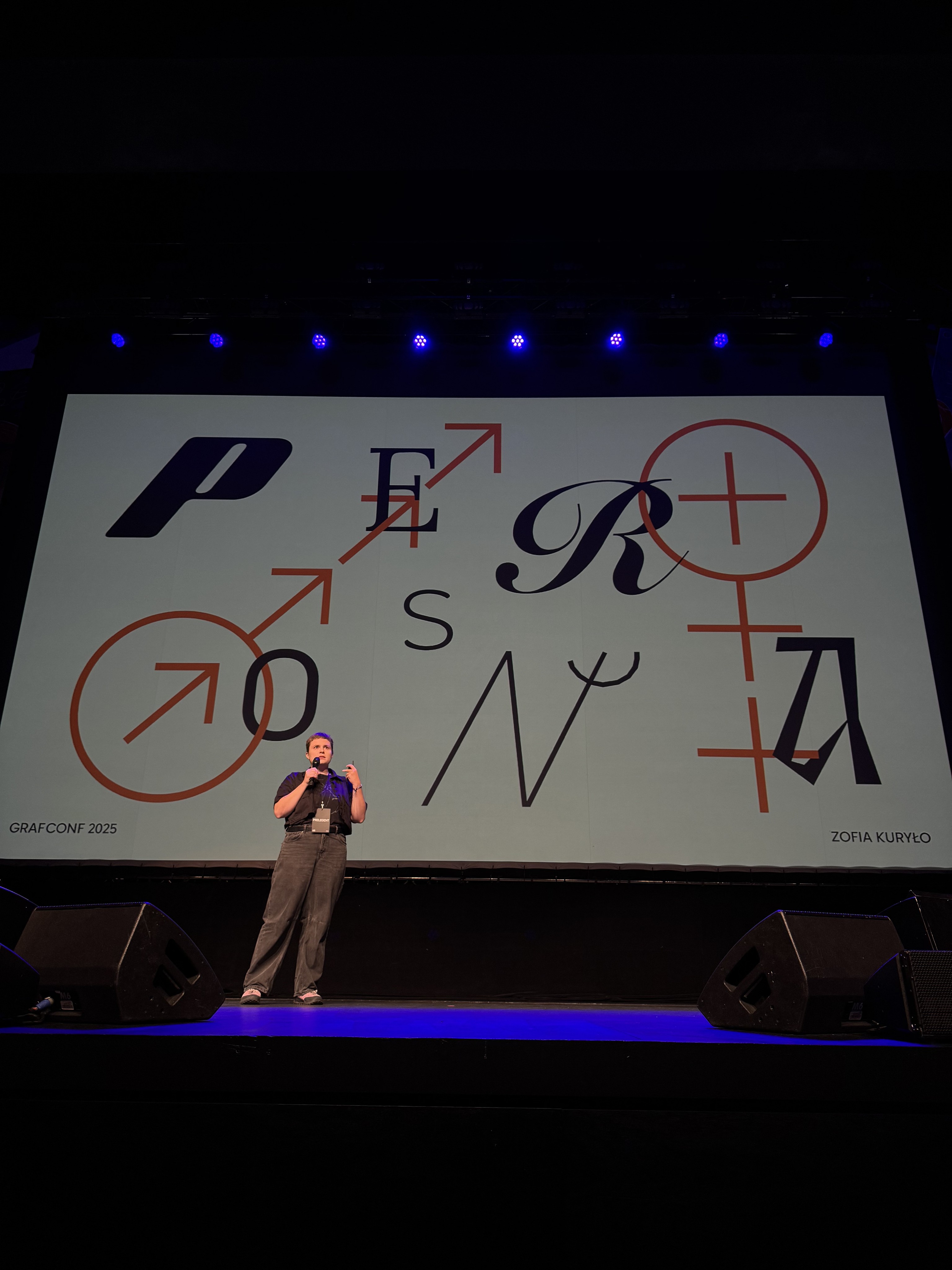
The project was presented at GrafConf 2025

" height="4px" id="idGggwY6f" width="45.58297636017676px"/></svg>)
" height="22.232223018282525px" id="LdoOKmsfx" width="22.23222301828264px"/></svg>)
" height="21.920310216783037px" id="JovyhregQ" width="21.920310216783037px"/></svg>)